Metro Boomin // Boominati - Logo Set
Client: Metro Boomin // Boominati
Creative Project Manager: Arthikka Jey
Creative Direction: Arthikka Jey
Art Direction: Jack Riley
Design Lead: Jack Riley
Task // Concept
To engage and connect with its followers, Boominati coordinates apparel releases.
It is common for Boominati’s distinct logo mark to feature as a graphic component on the apparel items which are made available during these releases.
The task for this project was to create a collection of logo marks to appear on future apparel items. The logos needed to offer fresh imagery while maintaining the value of having an existing logo which followers recognize as characteristic to the brand.
The challenge, therefore, was to craft the set of logos in a way that was not foreign to Boominati’s existing visual systems while simultaneously making an original visual statement.
Ideation // Pallette
The visual presentation of Boominati brand is curated by its founder, Metro Boomin.
As a result, the look of the brand sees alignment with his own style.
Naturally, the first step in the ideation process was to research Metro Boomin’s personal fashion choices to further understand his taste and how it can be reflected in the logo marks.
These observations along with considerations of former brand imagery informed the development of mood boards and ultimately the color palette for this project.
These observations along with considerations of former brand imagery informed the development of mood boards and ultimately the color palette for this project.

Iconography
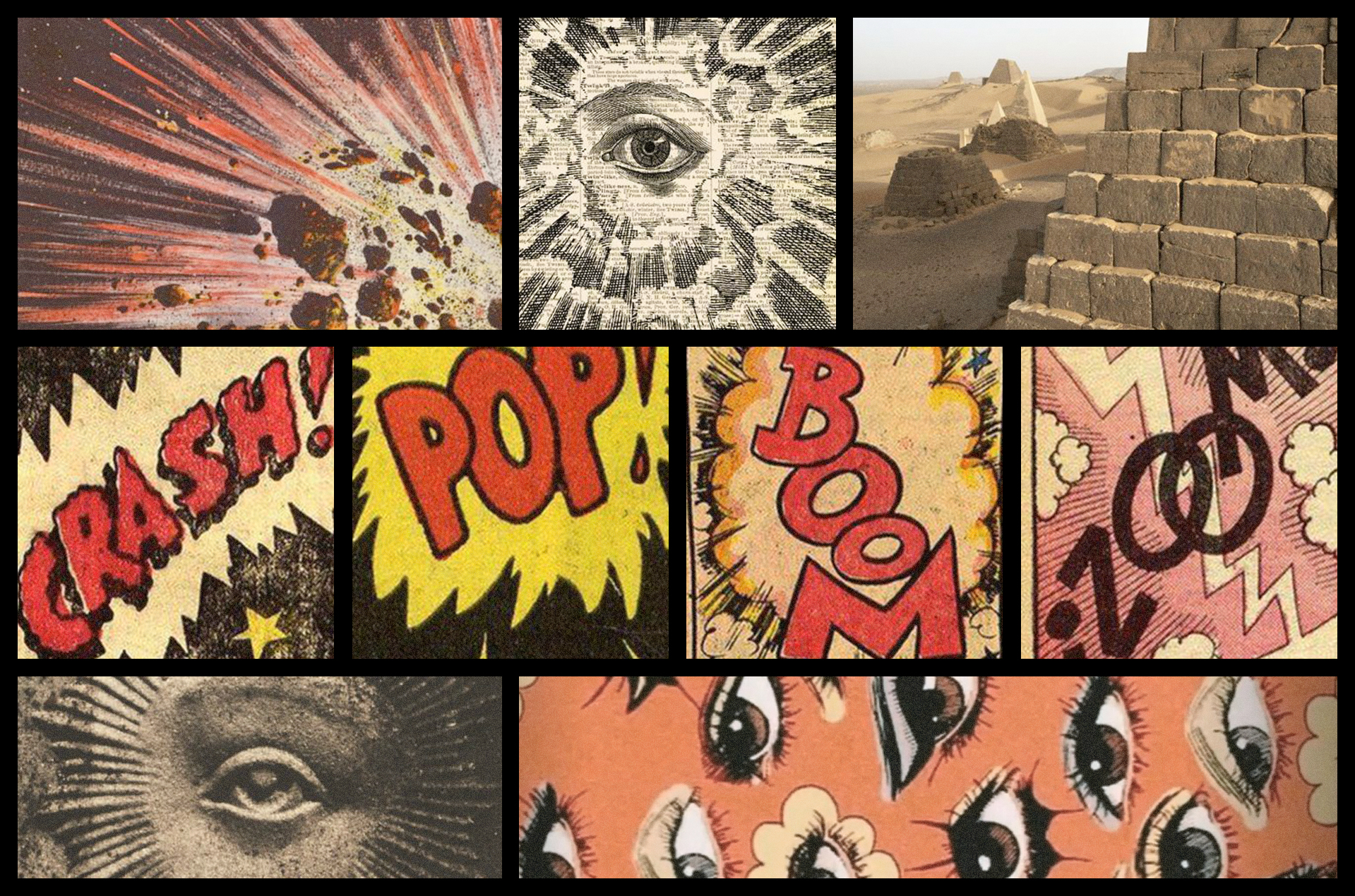
The icon development process involved referencing the research conducted in the ideation stage.
The approach most specifically leaned into the pyramid, blast, and eye symbol references, all while embedding an animated feel through the unworldly proportions seen between the different elements.
The primary objective with the icon development was to effectively solve the problem cited in the task while visually capturing Boominati’s mission to make an explosive impact on culture.
The primary objective with the icon development was to effectively solve the problem cited in the task while visually capturing Boominati’s mission to make an explosive impact on culture.
Application // Presentation